
Responsive Website Design: Reality From Hype
When it comes to website design, businesses want all the bells and whistles that make their site stand out from their competitors. But a responsive website is just as important – if not more important – as a beautiful design. If your company’s website is visually appealing, but it’s difficult to navigate, doesn’t offer good user experience and confuses visitors, then, the look of your website is pretty much in vain. According to the 2016 Adobe State of the Content Report, 65% of consumers ranked display as the “most important aspect” when it comes to consuming content in their personal life. And nearly 8 out of 10 consumers would stop engaging with a piece of content if it didn’t display well on the device they were using.
As we move towards a mobile-first era, responsive website design becomes even more important for brands. Unfortunately, as much as 60% of small businesses are failing to adapt to the demand for a responsive environment. With mobile devices making up 61% of Google’s organic search traffic (and 51% of Yahoo’s organic search traffic), Google is prioritizing responsive websites in its search engine results pages (SERPs). So an unresponsive website design can hurt your search engine optimization (SEO) and thus, decrease your online visibility.
WHAT IS A RESPONSIVE WEBSITE DESIGN?
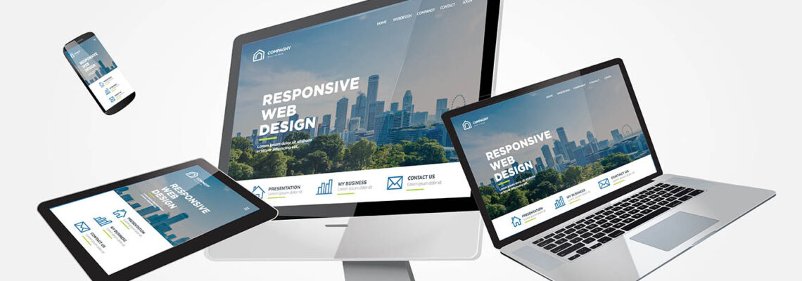
Having a responsive website design means that your company’s website “responds to” or resizes itself according to the screen size of the device being used. A responsive website has a good display that shows up well on a variety of devices including mobile phones, tablets, laptops, and desktops. For example, a webpage has three columns and shows up quite well on your desktop or laptop.
But when viewing the page on your smartphone’s much smaller screen, you are forced to scroll horizontally, some elements of the page are completely hidden from view, images are distorted, and the site loads extremely slow. Frustrated with your experience on the website, you click away and go to another site. A more responsive site would either display its content in a single column or allow users the ability to swipe over to view other columns. Images show up clearer and automatically adjust to the device’s screen size. This makes the content more readable and easy to navigate.
WHY IS RESPONSIVE WEBSITE DESIGN SO IMPORTANT?
In 2015, Google changed its search engine algorithms, which now factor in a website’s mobile presence as a ranking signal. So a mobile-responsive that design has readable text and doesn’t require zoom, allows adequate space for tap targets, and has no horizontal scrolling will take priority over non-responsive sites in the SERPs. This helps increase your website’s visibility.
A mobile-responsive website not only helps SEO, but it can also increase sales and conversions. 62% of companies that designed their websites for mobile platforms saw a significant increase in sales. And for good reason. An unresponsive website can make any frustrated user click away and go on to a competitor’s site. But a website that’s responsive to mobile devices can keep users on a page longer and can eventually lead them to purchase. So if your website is badly designed and doesn’t show up well across multiple devices, then you stand a chance of losing potential customers.
Per Adobe’s State of the Content Report, 45% of consumers believe that a website should be responsive across multiple devices. So your brand’s website shouldn’t just look good and easy to navigate on one device. People are increasingly using multiple devices for browsing the internet, searching for information, social networking, watching an online video, managing finances, planning a trip, and shopping online.
According to Google, 90% of consumers now move “sequentially” between different devices the same day. For example, a user discovers a product or service online while they’re using their desktop, does more research on the product or service in bed while on their tablet, and eventually makes a purchase on their smartphone while on the go. If your website isn’t responsive across multiple devices, then chances are the customer wouldn’t be able to perform all these tasks on different devices.
THE TRUTH ABOUT RESPONSIVE DESIGN
Designing a website for multiple devices is much more difficult than designing for a specific device. For example, images have to be scaled down depending on device width. This can make images larger than they should be and make them appear blurry. Also, web designers have to optimize images so that users with limited data connectivity don’t have to wait long periods of time for them to load. You would need someone skilled in CSS to make the images more responsive.
Displaying data on multiple devices can also be a challenge for web developers. Tables work well on large screens, but not on mobile devices. The designer would have to make the table mobile-responsive, while at the same time, avoiding the use of horizontal scrolling.
Adding responsiveness to a fixed-width layout is also a task some web designers struggle with. For an app with a more complex UI, it would be difficult to fit it into a responsive design. This would probably require the designer to create a new layout from scratch for a smaller screen.
WEB DESIGN MISTAKES TO AVOID
Web designs can go wrong and when they do, they can have a negative impact on your bottom line. Below are a few web design mistakes you should avoid at all costs:
- Your website is not mobile-friendly. A bad mobile experience makes it less likely for a prospective customer to engage with your company.
- Your website takes more than three seconds to load. Over half of users browsing on a mobile phone expect a webpage to load in two seconds or less.
- Your website’s font sizes are too small and not reader-friendly. A user won’t have a good experience on your website if the text is too difficult for them to read. At Virtual Assistant Canada, we understand the importance of responsive design and how it can affect your bottom line. Work with us and we will design your site in a way that offers users a great experience on a variety of devices.
Leave Your Comment
You must be logged in to post a comment.